 The process of planning a trade show attendance is very complicated but contrary to popular belief, the task of securing a place at a trade show is the easy part. Once you know the size and shape of your exhibition stand or tradeshow booth you then need to dress it accordingly to spread your brand message, to achieve all of your business goals and ultimately to secure good return on investment on the purchase of your booth.
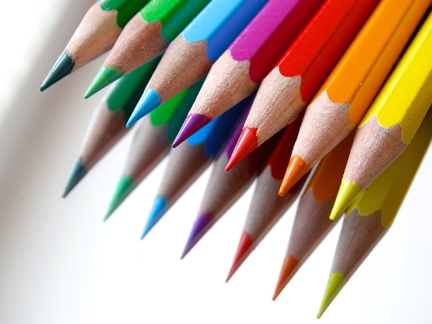
There are many things that we consider to be important when co-ordinating the design and organisation of an exhibition stand, but one thing that often gets overlooked is the role of colour. The tones used on your exhibition stand not only help to keep your overall appearance in line with your brand guidelines, but they can influence thought processes and emotions that passers by relate to your company too! The colour you use on the posters, pop up display stands and any other element used to create your exhibition stand do matter. Are you thinking of choosing any of the colours we have listed below? Read on about the effect it may have on your customers, before choosing your colour scheme!
Blue – calm and loyal
The colour blue is seen as provoking a sense of calm and relaxation, perhaps due to it associations with nature and the wide open sky! As well as making passers-by feel at ease, it is also suggested that this shade can increase productivity, perfect for ensuring your staff perform well! If your brand message supports making your customers feel calm and secure, then blue may be good for you.
Purple – royal and mystic
A deep, rich purple is associated with royalty, giving off a sense of luxury and authority. If your business is promoting a new, exclusive product or service as a trade show, using a darker purple may help to create interest in the item.
Red- strong and stimulating
It is no secret that red is a strong, intense colour, but did you know that is can have a physical effect on the human body? This hue can often cause increased blood pressure, causing the heartbeat to race just that little bit faster than normal. If you are thinking of using the colour red, do so in only small, focussed areas, so as not to overwhelm your customers!
Yellow – optimistic and cheerful
Yellow is bright and airy, often associated with the sun and summers days, provoking a sense of optimism. Orange can also have this effect, providing a less intense burst of bright, vibrant and fresh colour.
If you need help choosing which colours to use on your exhibition stand, our dedicated team of graphic designers will be happy to help! Get in touch with us here at PrintDesigns today, to find out more.