Occasionally, when receiving a design brief there are no clear guidelines as to colours, fonts or layout to be used within the design. Therefore, I need to find a starting point. I start by looking into the company branding a little more. By looking at their website, business cards, brochure, etc. it can often give me a good starting point and/or clear idea of which direction for the style of design.
However, sometimes the branding is not that specific, or perhaps is outdated, so it is not much help! In these instances I need to work with what I have been supplied, which is usually just a logo, photos and wording to be included in the design. The logo can often be utilised to create a good foundation for the design. By incorporating the same colours, fonts and any graphic elements from the logo, they can create a good base and help to create a look of a ‘brand’ within the design.
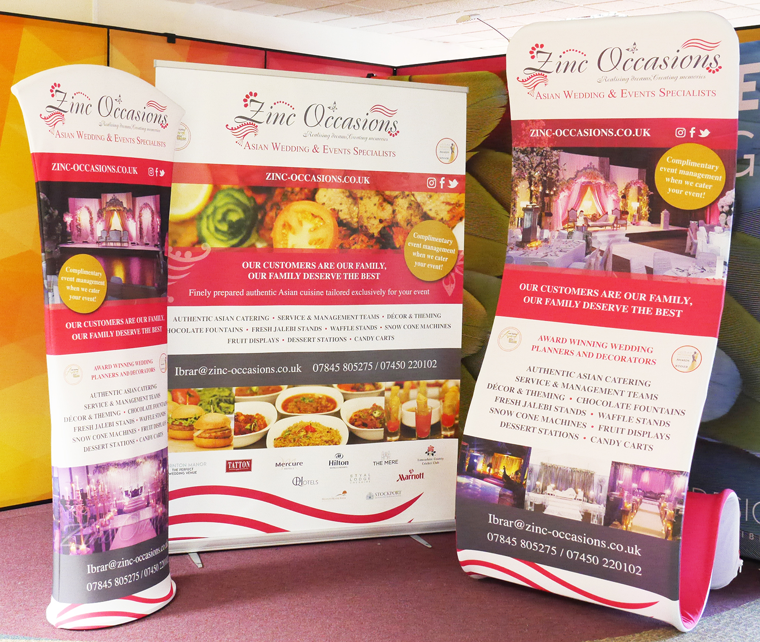
A few days a ago I received a brief for three exhibition stands for an Asian wedding organisers called Zinc Occasions. In this case they did actually have a nice clean modern website and business card. However, they were fairly simple and clean, with large photos and quite minimal, and my designs needed to incorporate a lot of text and images, so it was not possible to keep it as clean as minimal as the website. They did, however, have a very stylised logo, so this was the perfect opportunity to utilise elements of the logo to create my design.
As you can see from the photo below I used the same pink and grey and the same font as in the logo. This helped to tie the design together. On the large roller banner I also replicated a few of the graphic elements from the logo to add some extra focal points. The fabric stands were for a more corporate event so I didn’t use the ‘swirl’ elements on these but by using the pink and grey throughout gives a nice strong ‘branded’ look throughout all three stands.