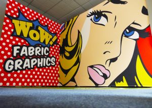
I do many designs for many customers, but I also have requests internally. Mark, our director here at Printdesigns, asked me to come up with something our production staff could print on a sample print for our showroom.
We have a fabulous new solution for cladding shell schemes, simply one huge print that spans across each shell scheme wall. It’s a lightweight solution that no longer has the need of using many separate panels and trying to piece them together. Mark has had many enquiries about this great product recently and has also had requests for a video demonstrating how the prints attach to the wall and showing how the finished article looks on display.
I like to make my sample prints eye-catching and engaging. They have to show the product off well in our showroom, so I like to use imagery that is large and bold, often using just one large image. This makes it look really striking and vibrant. Bright colours are a must! Subconsciously large bright colours create a positive attitude when looking at them, as opposed to a dull, monochrome image. Obviously there are many occasions where dull or monochrome are best to fit the brief, and can look great in the right setting, but when trying to promote a large printed product, then colourful and bright definitely show off the product to the best of it’s ability.
Mark decided he would like a Pop Art theme for this particular display so I set about putting something together that would look great on video. Pop Art is a perfect theme for a ‘big, bold and colourful’ brief, and I think this works really well, I hope you agree?
Mark will be making the assembly video in the next few days, so keep an eye out for it appearing on our YouTube and social media pages in the near future!


