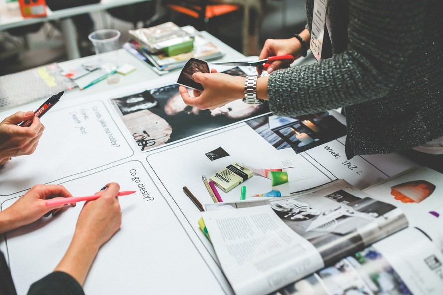
 To make your business successful you need to promote yourself effectively. This can be done internally through re-branding your company, refreshing your website and updating your sales pitches, as well as improving your external appearance at conferences and trade shows using well-designed exhibition stands and display stands. Although this is an opportunity to you to be creative, marketing materials should follow a few key rules so they can help to boost your sales.
Colour
Use of colour is very important and graphic Designers have long known the significance of colour when designing posters and other promotional materials. Here is a run-down of the most common colours, and the kind of image they can project to your consumers:
Red – A strong and vibrant colour, red can grab attention (when used sparingly!)
Blue – Blue is used by many huge brands as it gives out a ‘cool’ vibe – in both senses of the word!
Green – Being the colour of money, green can often project thoughts of wealth.
Purple – Similarly to green, purple has connotations of wealth and prestige. As it’s associated with royalty it can add a touch of elegance to your brand.
Orange – A vibrant and energetic colour, orange is perfect for projecting a fun and funky image.
Black – When you want contrast, black is a strong, sleek and versatile colour that can give your posters, brochures and display stands a modern feel.
Design is all about creativity so you can pick whatever colours you feel best suit your brand. However, try to pick shades that complement one another and make sure you’re consistent across all your output to create brand synergy.
Logo
As with colour, your logo needs to be consistent across all of your marketing materials. A strong logo can help propel a brand, so think carefully about the colour and shapes you might use in this too. Symbolism can also be important. Starbucks for instance, when designing their iconic logo, used elements from Greek mythology. The siren at the centre of their logo is a depiction of the mythical creatures who lured in sailors with their enchanting voices. This imagery captured both coffee’s seafaring history and Seattle’s strong connection with the sea.
Text
A tip for posters and large format products such as display stands is to keep your wording simple, and try to be minimal. For leaflets or brochures, again try to keep your writing clear and easy to understand – nothing is more off putting than badly worded or ‘frilly’ text! Keeping your marketing materials simple is so important we even wrote a whole blog post on it, which you can find here for more tips and advice!
Here at Printdesigns we offer an excellent high quality printing service for all your marketing needs. If you’d like any more tips, tricks, and advice get in touch and one of our friendly and knowledgeable members of staff will be more than happy to help!