Colour does more than just add visual interest. Our brains evolved to be particularly conscious of colour, for numerous reasons: to identify edible foods, to recognize patterns to avoid danger, and even to communicate. Colours capture our attention, and our reactions to them are deeply ingrained. It is no surprise, then, that colour psychology plays such an important role in marketing and branding.
 When you opt to use a display stand to promote your products, you’re banking on your ability to create an eye-catching display. But you’ll need to do more than be eye-catching—you also have to be enticing. A striking design can grab attention, but colours can be used to communicate subtle messages that deeply affect your potential consumers. Here are some of the basics behind the most popular colour choices:
Red
Perhaps the most popular marketing colour out there, red product display stands communicate excitement, urgency, and appetite. There’s a reason that so many fast food restaurants and department stores use this colour: it says, “You want more, and you need it now!”
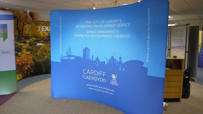
Blue
Competence, security, reliability, and serenity. Often used with communication-oriented brands—think about some of the most popular social networks. Facebook, LinkedIn, and Twitter all use this colour to project an inviting, welcoming, environment for sharing and communication. You’ll also see blue frequently used in the field of medicine for the same reason—check out the pharmacy aisle the next time you’re there, and see how many soothing or healing products feature blue.
Green
This is the third of the top three marketing colours, but that doesn’t mean it’s less effective. Health, vitality, and natural energy are all associated with green, as is power. Environmentally oriented products, natural/organic products, and self-help items all tend to utilize this empowering, encouraging colour in their marketing efforts.
Black
It’s no coincidence that formal affairs are black-tie events. This powerful colour is associated with boldness and elegance. Black is a high impact colour, so it can be overwhelming, but it’s hands-down the best colour for communicating authority and celebrating long-standing tradition.
Yellow
Yellow is easily the most attention grabbing colour—it leaps out from the background. It’s also associated with happiness and optimism. However, yellow is so stimulating it can be difficult to use well—it can induce anxiety if the attending message isn’t positive enough.
Whenever you’re creating a display, it’s always a good idea to think carefully about every design element in order to communicate your message effectively—including colour. Speak to our graphic design team if you need any help!