 You may have heard Pantone refer to the ‘colour of the year’ recently—this year, it’s Greenery. The most famous one in recent times was ‘Radiant Orchid’, partially because of the whimsical purple it denoted and partially because of the incredible name. But what’s the difference between these three colour models?
RGB and CMYK are both kinds of colour systems that denote printing, but Pantone is more a standardised colour wheel so when someone says ‘Pantone 280 C’ everyone knows what shade they want to achieve, whether they’re working with RGB or CMYK ink. RGB and CMYK are both methods used to find colours when working with colours digitally or with real ink and paper.
RGB
Unsurprisingly, RGB stands for ‘red green blue’. This is the kind of colour your computer screen uses, whether you’re using a Mac, a Windows laptop, or a tablet—all screens, across the board, use it. It’s a light additive model, so when you add light, the colours get lighter. Combining red, green, and blue in this model gives you white, and just combining two colours gives you a lighter combined colour.
CMYK
CMYK is the printer’s standard. Most printers—from the laser colour printer you use at home, the office printer or industrial printers—use CMYK. The acronym stands for ‘cyan magenta yellow key’—where key is the black, known as K because of its use as a ‘key plate’ inside the printer.
Unlike RGB, CMYK is a subtractive colour model—instead of adding light to get the shade you want, ink must be removed to achieve a lighter shade.
RGB can be converted into CMYK, but you might notice if you do this yourself that some of the colours become duller. While we at PrintDesigns are used to the effects of converting the colours on a computer onto the page, it can look worrying for someone who is new to industrial printing.
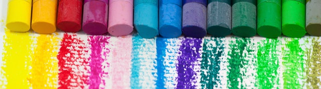
One foolproof way of making sure you get the exact shade you are aiming for with your designs is to consult a Pantone colour chart and nail down the right colour. Many of the Pantone shades have colour names, ranging from Scooter (a deep purplish red) to a gorgeous light blue called Island Paradise, making them easier to remember.
To avoid any confusion, if there is a colour that is very important to reproduce exactly, go for a Pantone reference when sending over artwork—the printer will know what you mean.